Showing posts with label kitchen. Show all posts

Monday, July 14, 2008

The House I Grew Up In


Wende asks: If you could, would you buy the house you grew up in?

Strangely, I currently had the above picture which was taken when my family first moved into the house. My dad gave me this a few weeks ago so I could scan and preserve the image for him. Obviously it doesn't look like this now, in fact, just a few months ago, my Dad had the windows in the back of the house (both bedrooms) extended down to the brick line, changed some of the kitchen cabinetry, and installed all new stainless appliances.

Finally you can look out of the windows in the bedrooms! As a kid, it was both frustrating and scary hearing all the sounds of the outdoors but not being able to see anything. It was the same room design that prisoners have and came with a similar trapped feeling.

Though the house has gone through a lot of design changes and updates, the answer to Wende's question would still be no. I would still hold out for the bungalow cottage owned by the Barnes on the other side of the street. That house started it all. Their corner lot, fenced-in backyard for Bridget the dog, and finished attic bedroom was a dream.

Thursday, June 19, 2008

C'est tres chic!

I have a great kitchen cabinet makeover for you this time.

What do you say about upholstered kitchen cabinet doors?

Sound like something out of your budget? Something too luxurious to imagine?


Well, what if I say no. It is just a very do-able DIY project from the sweet Veronique of Tres Chic Veronique. I discovered her blog after seeing an adorable dress she had just made on her Flickr stream.

Once the beautiful yellow and black Honeybee fabric from Etsuko Furuya's caught my eye and I got over the surprise that the fabric really was on the doors of her cabinets I knew I had to share this greatness with others. Her cool tutorial is here.

Tuesday, November 27, 2007

SHELTER Sets: "You're gonna make it after all..."


When I think young independent career woman on her own I think - Mary Richards on The Mary Tyler Moore Show. When I think of a "career-gal" apartment, I think of Mary's attic apartment in the 1892 Victorian at 119 N Weatherly Ave. in Minneapolis.*

What did I like about her place?

The open space, the big windows, and the pass-through kitchen. I have always wanted one of those. I imagined that when I had a party, I could keep in on the action by listening through the opening and yelling cute contributions to the conversations in the other room. However, I never really had one of those apartments, in fact, I have never even been shown one of those for rent.

My current apartment is the closest; I have an extended breakfast bar separating the living room from the kitchen. However, sometimes too much of my kitchen is visible, so I will be installing a curtain drape to pull over when the mess threatens to take over the rest of the apartment. But I did have something in common with Mary. Even though I never had her pass-through, I sure had plenty of Mary's "bad" parties.


Layout of apt D, 119 North Weatherly Avenue (click to see larger)

I found an incredible article at The Mary & Rhoda Magazine that details the design and contents of Mary's apartment and even helps you source the items that were used in its decor. Now I don't know that many people today who would want to live in the apartment as it looked then. However, if you are interested in set design and how you can show aspects of a character's personality through their living environment, it's a fascinating read. Think about it, would Monica Geller have been the same without her lavender painted apartment and mis-matched kitchen chairs?

Interesting facts about Mary's first apartment:

  • The apartment had to look like the rent was only $130 per month in 1970.
  • A real attic apartment would NOT have a sunken living room. However, it gave them two levels to the set, which would make it possible for all the actors to be seen during group scenes like Mary's infamous parties.
  • When Mary did move to a better apartment, a lot of her furniture and things moved with her. Some were re-upholstered or refinished, just like someone would do in real life.
  • The kitchenette that I loved so much had a stained glass panel that could be raised up and down to hide the kitchen if needed.
Some of the items used to give Mary the impression of being a young, educated, career woman with traditional values:


Toulouse-Lautrec's Jane Avril, 1893

And her one modern touch, a futuristic Laurel lamp.


*The real location of the house was 2104 Kenwood Parkway, where the house is currently worth over three million dollars.

Apartment blueprint from here uncredited, though I think it's the work of artist Mark Bennett.

The Mary & Rhoda Magazine
The Mary Tyler Moore Show Online!

Saturday, November 17, 2007

Another Refrigerator Makeover!

As I have become the girl that highlights all DIY refrigerator and kitchen makeovers (here, here, here, and here), I can't believe I waited until now to post this one.

This one was featured on Design*Sponge as part of her new DIY Wednesday segments.

My SHELTER suggestion: As an alternative to felt you can also use those colorful foam sheets found at Jo-Anns and Michaels.

Project created by the team at The Curiosity Shoppe

Tuesday, September 18, 2007

The Kitchens of My Dreams

Over the last two years I have discovered that I REALLY don't like the stainless steel appliances and other attributes of the modern kitchen that is so popular these days. It seems I want the kitchen that everyone is getting rid of as soon as they buy a house. The ones I see on the Internet and in magazines that I like tend to be reminiscent of an older era. However, the colors scheme can be quite varied from either pale spring-like colors to a bold riot of bright colors. SUBTLE: day-lab's awesome redo Dooce's old one before the remodel Pink loves Brown BOLD: First, this great idea, in pink and then in yellow. April 2006 Domino spread Jordan's kitchen shelves Then, these multi-color examples. My House is Cuter than Yours' kitchen House Tour from AT-San Francisco firehouse kitchen from Google Supershoppertoo on Flickr My little temporary fix Last but not least, my dream kitchen floor to go with either color scheme is this one made of cut and assembled linoleum pieces, seen in the December 2005 issue of Domino. This picture from Decor8, however, is from another reader that was inspired by the same story as I. I love the mixing up of different colors intensities. I would work this out with whatever color scheme or mood I chose for the decor. Fewer colors and lighter shades for subtle; more varied and brighter for bold. Attention: day-lab is starting her own DIY-focused blog at day-lab-diy.blogspot.com. She is asking for submissions, go see more information here. Sources: Flickr, the blogs credited above, Apartment Therapy archives, and Google images.

Thursday, August 23, 2007

More Martha at Macy's

I stopped by Macy’s yesterday to torture myself looking at shoes. Since I was there, decided to check out the new Martha Stewart Collection. My particular Macy’s seemed to be taking it slow, only half of the department was set up and hand written signs were stating where certain kitchen tools would go.

Some of the basic kitchen utensils like spatulas and slotted spoons were there but I wonder just how different are these from the ones she has at K-Mart? Maybe they have prettier handles?

One thing Martha is definitely doing is trying to grab as much business as she can. Instead of offering just one type of item, she is offering many different styles for different customers. She has five different types of salt and pepper mills ($30-$40) and five distinctly different spice rack systems ($40-$60).

I thought this was very clever and attractive, a collapsible colander, available in blue, red, and lime green for $15.

Good news!

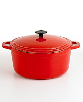
Even though they are still not shown on the Macy’s website (probably scared the website would be jammed) the turquoise and red cast iron pieces are in the store and are also available online through the Wedding Channel’s wedding registry. Best of all, they are on SALE! The 5 and 7-quart Dutch ovens are currently 50% off, from $119 to $59. This is true at the stores too, so you better run rather than walk!

Comparing them to my own Le Creuset, they seem like the real deal. (But what else would you expect from Martha?) The colors are so beautiful in real life that I might buy the red one in the 7-quart size to complement the 5-quart one I have as part of my hunter green Le Creuset group.

These melamine bowls ($30 for 6) are a great deal, but I really loved a miniature set of these that they had for $10. They were meant as prep bowls for those 3 tablespoons of allspice or coriander needed in recipes but I think they would be excellent for condiments at a buffet event. I also think a few would look great in my office holding paperclips and miniature rubberbands.


Martha is also selling cake and cookie mixes too. In cakes, she is selling chocolate, white, and lemon cake mixes for $12 each. However, I prefer the $10 sugar cookie mix because she is selling her decorative colored sugars and sprinkle sets to go with them ($14 now, but regularly $20 each). The sugars also can be used with her new 4-piece birthday cake stencil set for $15. I really should have bought that cookie mix when I was there.

Well, I guess I have to go back and check out the completed store setup, right?

Wednesday, March 28, 2007

Yet another way to change your kitchen


What, you don't like the cupboards in your kitchen and can not afford to replace your kitchen appliances from the 1970's?

Buy $30 of paint and you problems will be over.

"The basic color scheme is a soft buttery yellow for the cabinets, with periwinkle blue on the cabinet handles. For the appliances, Susan Churcher used rust-resistant paint for metals. She painted the oven doors periwinkle blue then touched up knobs and dials in a bright orange enamel paint."
Check out the details at Sunset magazine.

Monday, March 26, 2007

Another papered refrigerator...


Paula Smail covered hers with a London A-Z street map.

Sunday, March 25, 2007

How to wallpaper your fridge...

My 100th Post !!!
How much do I love Time Out New York? SO MUCH.

I first saw the NY travel guide after I had arrived in the big apple. That was way too late, you need this guide ahead of time so you can highlight and map all of the things that you want to check out when you get in town. Afterwards you need to take it home so that you can have the time to read the little articles that they produce for entertainment, like this one.

I remember Nick Olsen from an issue of Domino magazine where he covered his refrigerator in a floral wrapping paper.


Now, here he is in Time Out helping another New York apartment dweller do the same to her graffiti-covered fridge with the instructions included. Nick claims that it will be reversible and fine for renters.


Now their total cost came to $170 but that's only because they used $155 a roll wallpaper! One can easily do this project with less expensive but still gorgeous papers like these from Papermojo. These individual sheets range in price from $2-5 dollars for 20" x 29" sheets.


You should also check out TONY's Tossed and Found posts with the design team Wary Meyers. They take objects or furniture off of the NY streets and recreate them as new decorative items.

*For more inspiration, check out this older Shelter post about covering your cabinets with art posters.

Monday, March 12, 2007

So much beauty in a small space

I just looked through the March/April 2007 issue of Blueprint magazine. The new Editor-in-chief received a makeover of her 307 sq ft apartment done by the staff of the magazine.

It blew me away.

Check out the online version of this article.


What inspired me:

  • The use of wall shelving for storage that takes the least amount of floor space.*
  • The blue Le Creuset dishes on those shelves, which apparently are only available in the U.K.**
  • The curtain used to divide the living space from kitchen.*
  • The handmade television cozy for her flat-screen.*
  • The patterned bolster pillows for the sofa with the same fabric (in a different color) used in the bedroom.
  • Painting everyday objects to make them part of your decor. They painted her andirons with Surf Blue paint from Benjamin Moore.


*
The site includes instructions for the shelves, the curtain, and the cozy.

** Photos from Blueprint magazine and John Lewis.com.

Sunday, February 18, 2007

Small Homes that Live Large

I love how small homes, not McMansions, are getting more popular. Of course, what is considered small is relative. My idea of small would be someone else's idea of a shack. But what is important is that some people truly get it. That with the world currently holding more than 6.5 billion people, in order to preserve our natural resources we will have to get used to living smaller, living slower, using less, and using more responsibly. Of course, those can be two different issues, 1) a small house and 2) a Green house and more power to the people who achieve both goals in one.

I will be tackling the Small issue. Last week in the bookstore, I saw this great magazine, The Best of Fine Home Building magazine Small Homes that Live Large homes under 2,500 sq. ft (catchy title, huh?) It is only available on the magazine stand. The designs within are great, even though I think 2,500 sq ft is pushing the description of small. They have also published
More Small Houses, a compilation of 31 articles they have printed on the small home in the past.


The 720 sq. foot house above is the Bartlett Cottage house plan by Ross Chapin Architects, an architectural firm in Washington state. They design and build homes (small homes, bungalows, cottages) that seem like the type where neighbors borrow cups of sugar to make brownies that they then share with their neighbors at the block party later. They range in size from 700 sq ft of heated space to 2,400 sq ft. I believe their smallest is the Betty Lu at 708 sq ft. It is a one story house, consisting of a bedroom, living room, covered patio, dining alcove, small study and an open kitchen.


Tiny but well designed.

Credits: Floor plan and all home photos are from Ross Chapin Architects.

Friday, September 29, 2006

The Power of the Imagination


I found this via the web, of course. From ReadyMade magazine's blog, to the designer's site, Jonathanfongstyle, to my little blog, and now to you.

When Jonathan Fong discovered that posters were 40% off at a museum's Andy Warhol retrospective, he decided to buy a lot of them and decoupage his kitchen cabinets.


His cabinets were plain white laminate (like most rental apartments) and he applied the posters using regular Elmer's Glue. If you rent, you can eliminate his last step of applying five coats of acrylic polyurethane and it should not be difficult to remove them with a good soaking and an abrasive kitchen sponge when you move.

Affordable design and unforgettable style.

Check out his book, Jonathan Fong's Walls That Wow: Creative Wall Treatments Without Fancy-Schmancy Painting, for more great ideas.