Showing posts with label smallspace. Show all posts

Friday, February 21, 2014

Oh, Ross...Karina, Karina!*


As a follow-up to my last post, here's an example of a home I could move into immediately!** This is an example of a Ross Chapin Architects small home design, the Karina, designed by Karen DeLucas, former owner of the house shown. Please check out that last link, that blog will take you through the house timeline of construction, from insulation, interior/exterior paint colors, vendors used for lights and fixtures, flooring, and landscaping through text and loads of great photographs.


Yes, you do see stainless appliances and granite countertops in this kitchen. However, I feel the kitchen's small scale and practicality stand for more than those so-called HGTV "must-haves."


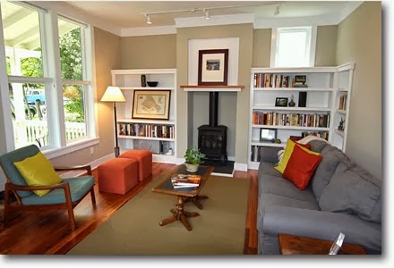
I love the wood tones and crisp calming colors of the interior design and truly adore the exterior house details.

Click to enlarge
The Karina home plan comes in at 1,606 square feet and is part of their collection of small homes over 1,000 sq ft. It's entire foot print is only 22' X 55'; however, the smallest of the three bedrooms is a healthy 11'-6" x 12', it still has 2 full and one 3/4 sized bathrooms and even a separate 2nd floor laundry room with space-saving pocket doors.

Brilliant, right?!


Now, the bath is a bit more swank than I would prefer with its attached-yet-separate tub and the glassed-in shower with "rain" head, but I wouldn't turn my nose up at the soft-close, low-flush toilets.

Lovely wrap-around back porch

* Loose adaptation of "Corinna, Corinna".
** IF I had the money and/or a job where I could afford the upkeep! ;)

Wednesday, November 06, 2013

How Little Can I Live With?

Much more than I thought or want.  Really.

My thought was to purge a lot of unwanted stuff and start over this part of my life by living more simply but I still ended up with...say it again?  Much more than I wanted.  This is what was left after a packed-car trip to the new place!

Does not include the furniture that I will take! 


The biggest space hogs among my moving boxes are the six and a half boxes and plastic totes devoted to sewing books and fabric.  That is even more than the space devoted to my finished items of clothing!  That does not even include the two sewing machines, a table and a wardrobe dedicated to hold everything.  For sure, this is not a hobby suited for minimal living!

I guess I will never be able to live like this:

http://webecoist.momtastic.com/2011/12/26/ultra-compact-interior-designs-14-small-space-solutions/
All-in-one unit. Designer unknown.

let alone this apartment in 300 square feet.

The funny thing is that I really thought I had less sewing "stuff n' stash" than most  bloggers I read until I combined the stuff from my bedroom closet, under the bed, in the wardrobe/armoire, on my bookshelf, and next to and in the sewing table. Yes, in denial, was I.  So can anyone show me a seamster/sewist* that does live minimally?  I'm serious, I dare you!


*Of adult garments, not quilts, children clothing or stuffed animals.

Monday, September 09, 2013

Cute Adaptive Reuse Nightmare

A co-worker directed me to this compilation of stories on WebUrbanist about adaptive reuse projects. They range from an airplane-now-home to an airplane hanger that is a completely contained beach resort.


Architect: John Perkins

One story that really intrigued me was this one on the bureaucratic nightmares involved in a seemingly simple project; converting a garage into a small residence that would fit into the preexisting urban landscape and meet all city codes.

So not as easy at it would seem.

Monday, May 27, 2013

SHELTER Sets: The New Normal

Note: NBC has cancelled this program but I still had a draft post for its set design, so here it is! In fact, here's a piece on the auction house, One Kings Lane that sold the remains.


I didn't get to watch it much because it was on the same time as some other show that probably got cancelled too but I still think Andrew Rannells is amazing. The main set, a Spanish Colonial Revival home for his character Bryan and his husband David is a gorgeous and believable abode for a the Monterey-based TV producer and a gynecologist. The house was based on the design and style of a 1920s home owned by Diane Keaton, perhaps because the show's creator Ryan Murphy (Glee, American Horror Story) owns another of her past homes.

Master Bedroom
Bryan and Tony shopping for props
Furnished and styled by set decorator Bryan Venegas and production designer Tony Fanning the New Normal home set is eclectic and full of leather, dark wood furniture and floors all accented by colorful tile and pottery. The rare and expensive Monterey furniture was replicated by an artisan woodworker.

Kitchen

Detail of kitchen island tile

Interesting tidbit gleaned from an L.A. Times article; the tile in the kitchen is fake. Trying to replicate the tile featured in Diane Keaton's kitchen would have been too expensive. Instead, they photographed the inspiration tiles and printed the images on medium-density fiberboard (MDF). They were then routed, grouted and sealed just like real tile. In another example of creative thriftiness, expensive pottery was crafted in foam and then painted to look like cement.

Home office
Dining room and home office
I don't know why more TV and film productions don't do things like that. If it looks the same on camera, why not? It helps the budget (in this case by thousands) and  the actors don't need the real thing. Win-win.

A detail from Georgia and Shania's cottage
However, the set I prefer on the show is not theirs but that of their baby surrogate and friend Goldie and her daughter Shania. It's compact one-room size with kitschy details, bright colors and its frugality is more my style. Too bad I couldn't find more photos of it.

Living room and bedroom
View from kitchen

Living room and kitchen

Images: One Kings Lane, NBC, Twentieth Century Fox

Monday, March 18, 2013

Hi...Anybody Still Out There?


The Dream
Wow
I can't believe how long it has been since I've visited this site. Sorry. My life has been so hectic that dealing with my home and/or reading shelter mags and websites has gone by the wayside. You will not believe what my apartment looks like now. No, not good. Not good at all. Every single surface has something on it, most likely something that should be stored somewhere else.

I have been sewing so a lot of that stuff is pattern pieces, fabric, and in-progress garments. My living space has become the messiest garment workshop ever!

Not only do I want to corral this stuff to its proper place but I also want to eliminate the other non-sewing related visual clutter. Years ago, I embarked on the Apartment Therapy Cure which was only successful in theory. Then, I moved onto the exceedingly hopeful Throw Out Fifty Things... program, however I failed that one too. I still believe in the author Gail Blankes' book and hopefully will get back to it one day. My goal is to simplify my life and get rid of about 50% of the stuff I own. I can't believe I once lived in an efficiency! Now my 550 square foot apartment is packed to the gills with stuff I use now, I once used, and stuff I'm holding onto for the life I'll one day have. Um, yeeeeaaah...right.
I hope that I'll be able to keep you up-to-date on my progress but that's something I can only say I'll work on. I do know that if I find articles that I think might be helpful to others I will be posting links to them here.

Here's an example of somewhere cute that I just don't think I'm capable of, in this New York Times article and slide show about living in a small space. Check out that under mattress storage!

Image: Martha Stewart Living via Blueprint magazine, March/April 2007.

Follow my blog with Bloglovin

Monday, March 21, 2011

Seriously, You Want Me To Live THERE?!

Currently, I'm looking for a smaller (and cheaper) apartment. At this time, I've only gone to see one in person. It was not encouraging. The ad I responded to did not have pictures and after I saw it, I totally understood why. The agent showing the place was late for my appointment so I piggy-backed on to her next one and the other girl and I were in and out of there in less than 10 minutes, all the time in shock. Gawd, at least paint the place first!

However, recently they posted pictures because presumably they must have gotten desperate. Let me show you what I witnessed.

The Description I Read:

Cute 2-Story Studio Apartment Available Now! Walkable to VCU! $600 rent includes water, sewer, and trash. Pet friendly with a one-time fee!

What I saw:


1st floor, living room w/ closet

What you see is all you get, that is the extent of the floor space. See the open door? Object in foreground is the angular staircase to the 2nd floor. Wish they had pictures of that, the individual steps were half the length they should have been, the whole thing was steep, and would have been almost impossible to walk up if sick (or drunk, since this is being marketed to college students.) The only plus was the ceiling was high, so that wall shelving system could cover a lot of space; needed because of that ONE tiny closet for your...well everything!


2nd floor, bedroom/living space

Ok, this room is a tiny bit bigger than seen in the picture, though I doubt enough for a double bed and decent walking room. It's really just a little bit over a foot to the right and in the foreground to the stair rail. Note the stylish ceiling fan.

The lovely kitchen and bathroom.

Note the width of the bathroom, it is almost exactly the width of the kitchen. I think they were trying to make the kitchen look bigger by not showing the other side. Ha!

That was the extent of the tour. Lovely, ain't it? If you've seen my apartment in any earlier posts, you know that my place is at least three times this size including two 8 foot wide by 10 foot high closets plus a small linen closet. Most important to know, my apartment was only $80 more in rent at the time. What nerve wanting $600 for that shoebox! So, this is definitely not THE one!  

Friday, October 30, 2009

Small Spaces Time

The new Oct/Nov issue of ReadyMade magazine is really promising. It is the Small Spaces issue. I perused it this weekend at the bookstore.

Don't you love how big box bookstores have comfy chairs for you to sit on while you read as much as you feel comfortably reading before you actually walk out of their store empty-handed? I do. Thanks-a-million, Books-A-Million!

When you buy the magazine, definitely check out the Julie Brabac's gorgeous A-frame house in New Hampshire on page 51 and also featured on the cover. Besides that actual home, this issue also includes shelters and spaces constructed from old grain bins, shipping containers, and wooden crates and palettes.

Check here for more of their on-line content.

Monday, October 19, 2009

A Dream

Two weeks ago, I came across a list I had written down a year ago of elements that would constitute a makeover for my apartment (if I had the money for anything I wanted). As it turned out, it wouldn't take much.

  • A paint job for the combined living room/dining area & kitchen in a pale shade of lavender, butter yellow, or a green tea shade
  • Long drapes from the 12' ceiling on the end wall with the French doors
  • Large graphic canvases on the walls
  • Stuffed armchair in purple or green velvet
  • A new sumptuous sofa
  • Side tables with gourd-shaped lamps
  • Small desk for a laptop
  • Set of red and yellow stoneware dishes

NOTE: This is NOT a to-do list. I already have one, these are just some thoughts.

Monday, September 07, 2009

Didn't Expect This, Did You?


But I saw this post on Sew Liberated and fell in love with this child's room arranged using Montessorian concepts and ideas. Isn't it amazing?

Image: Sew Liberated

Tuesday, August 04, 2009

This Is Where I Live In My Dreams


I just fell in love and I bet you will too.


Check out this post at Desire to Inspire.


Thursday, July 16, 2009

I Could Work Here...

yeah in my dreams. Somehow I always seem to need a surplus of desk space so I can stack "junk" all over my desktop. It's the way I roll.

However, someone else, especially someone with a laptop (I still possess a huge desktop monitor, not even a flat screen!) could really love this desk.

I just saw this cute setup, the Trovato Office-in-a-Box, on the New York Times website and saw that it was available at OfficeMax of all places for only $150. Compared to similar setups available (without the stool/storage cube) like the Jay desk & hutch available at West Elm for $330, this is a true bargain.

Friday, July 10, 2009

Affordable cottage in the NYT


700 square feet and bought for $95,000!!

I have to give it to The New York Times. When they catch my interest, they usually get it big time. You may have seen this first set of pictures on other blogs already because this place in the Catskills is beautiful. But what what struck me is how it truly was something I would be interested in. That price is incredible, it's almost impossible to find a house that cheap here in Richmond, though of course most people I know can't afford a weekend house, let alone a place two hours away from where they live and work during the week. However, I loved how they furnished the place with hand-me-downs, and purchases from Craigslist and to top it off also used it as the venue for their outdoor wedding! That's the way to get the most for your money!


I love the use of the green, which seems to change color subtly throughout the house. It's definitely cute and country but not too so. Check out that incredible stove, unfortunately it doesn't work though.


(Click to enlarge)

That gallery wall- designed hallway blows me away and reminds me of another that I featured on this blog before. The newspaper was supplied with a rundown of their decorating costs. Decorated for only $2,352! Other homeowners featured in the newspaper's regular features can't seem to even get a closet organized for that little amount of money.

This cottage reminded me a bit of this cottage I found in an old issue of Cottage Living, from the 80s, that I bought when I was in Fredericksburg. I love the cottage aesthetic, the airy feel, and the simplicity. The use of the darker green for the window blinds is perfect, it adds a dash of color that works as decoration 24/7 when the shades are up, whereas white curtains (the obvious choice) would add nothing to the room.


In this bedroom shot (one of my favorites!) the different shades of green with the rich yellows, the red side table, and the orange tones of the spool-turned bed really speak to me; a mix of harvest tones mixed with white gives the room a warm and cozy feel.

Monday, July 06, 2009

So, two clowns meet in Afghanistan ...

Every once in a while I check out the New York Times Real Estate section.

No, not to look at the expensive loft high rises that the city is famous for, but instead because I like to check out their Habitats columns. These stories usually focus on the middle class of New York; the artists, musicians, and store owners and the unique homes that they create for themselves.

Image: Ruby Washington/The New York Times


This past one I read though had a bonus; it was not only a story of a graphic and space-conscious apartment but also a love story. Please check out the lovely story of clowns Seth Bloom and Christina Gelsone here.

*Definitely don't miss the video interview (half-way down the screen page); that's what made my heart melt. What a story, what a job/mission, what a great couple. I wish them the best!

Also if someone has more detailed pictures of Christina's wedding dress created out of miniature white balloons I would love to see them! Now that's creative!

UPDATE: Christina, herself sent me this lovely wedding portrait. Too cool, right?


Friday, April 24, 2009

Angel's Other Space to Dwell

A year ago I wrote about stylist Angel Dormer's old, old apartment here. What I did not mention is that she saw (!) my post and sent me a sweet email. I would have written about that sooner but I then sent her a follow-up email asking if she would talk about that apartment, in a sort of retroactive SHELTER Study. She had also been featured in for a more current apartment. With this space she gained some more square feet as opposed to her former studio; however, her newer space was still quite small. I wanted her to compare the growth of her style and her obvious affinity for smaller spaces. Sadly, I never heard from her again.

Adorable Angel Dormer

So, I'm going to show you those pictures of that more recent place too since I had saved them for that post. It's a little more modern than my usual taste but it's color use still appeals to me. Enjoy.


Bedroom in a closet

A peek at the kitchen

Images: H&G magazine, New York magazine

Monday, March 16, 2009

NYT Home & Garden Section to the Rescue?

Surprising, huh?

Last week, the New York Times decided to task five NY interior designers/decorators with sprucing up the homes of five New Yorkers who had just lost their jobs. They were tasked with using a budget of only $300. Sounds good right? The article says that many got miffed about using that tiny an amount of money and only one was able to come in under budget. Bravo for Christopher Coleman, who was the winner in my book with a final balance of $296! While it was not my style, I have a feeling it fit well for his single-bachelor-tech-geek-client.


Styled by Christopher Coleman

You would think the others would realize that future clients; people who will be looking at their work in this assignment, might find it a plus that a designer CAN actually come in on or under budget.


Rearranged by Hilary Unger of Perianth

Well, at least for me that would be considered an important quality to have in a designer. Not that they did that bad, they still all came in under $500 and the results were all lovely. I just felt bad for the designers that could have easily come in at or under budget if they had just invoked some DIY and repainted furniture or items that the client already owned. Of if they had installed hardware and stitched the simple cushions and pillows themselves instead of hiring outside workers. What a great message that would have sent too.


Rearranged by Bradley Thiergartner

Links to the makeovers:

One-bedroom - $296 by Christopher Coleman

One-bedroom - $304 by Bradley Thiergartner

Studio
- $326 by Hilary Unger

2-story house
- $452 by Fawn Galli

Shared apartment
- $490 by Elaine Griffin


This story was published in the NYT on March 12, 2009.