
Showing posts with label mystyle. Show all posts

Friday, February 21, 2014

Oh, Ross...Karina, Karina!*


As a follow-up to my last post, here's an example of a home I could move into immediately!** This is an example of a Ross Chapin Architects small home design, the Karina, designed by Karen DeLucas, former owner of the house shown. Please check out that last link, that blog will take you through the house timeline of construction, from insulation, interior/exterior paint colors, vendors used for lights and fixtures, flooring, and landscaping through text and loads of great photographs.


Yes, you do see stainless appliances and granite countertops in this kitchen. However, I feel the kitchen's small scale and practicality stand for more than those so-called HGTV "must-haves."
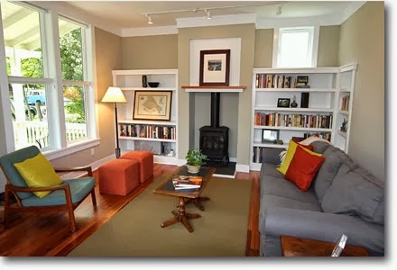

I love the wood tones and crisp calming colors of the interior design and truly adore the exterior house details.

Click to enlarge
The Karina home plan comes in at 1,606 square feet and is part of their collection of small homes over 1,000 sq ft. It's entire foot print is only 22' X 55'; however, the smallest of the three bedrooms is a healthy 11'-6" x 12', it still has 2 full and one 3/4 sized bathrooms and even a separate 2nd floor laundry room with space-saving pocket doors.

Brilliant, right?!


Now, the bath is a bit more swank than I would prefer with its attached-yet-separate tub and the glassed-in shower with "rain" head, but I wouldn't turn my nose up at the soft-close, low-flush toilets.

Lovely wrap-around back porch

* Loose adaptation of "Corinna, Corinna".
** IF I had the money and/or a job where I could afford the upkeep! ;)

Saturday, February 15, 2014

My Future HGTV House Hunting Episode


My unemployment has led me to watching a lot of HGTV. Shows such as Property Virgin, Love It or List It, Property Brothers, and Househunters (domestic and international editions.)

One thing I've noticed is how I judge the house hunters on how flexible they are in their searches. The majority of them expect to go out and find a house specifically designed for them; the 2nd largest group has eyes that are bigger than their budgets (everything must be high-end and move-in ready), and only a small minority can see the benefit of getting a house short of their ideals and then remaking it specifically for themselves.

Even when the house buyers have been thinking of their dream homes for months or years, they still come up with so-called "deal breakers" that they didn't think of beforehand. After seeing realtor frustration in show after show, I took some time to see just how difficult I might be if the time come.

I have separated the lists into the following categories:

Deal Breakers (Do not even show me these things)

• A new build in a development
• Attached home - need natural light
• Flat roof - prone to snow and rain issues
• Dark rooms with no possibility of natural light, via windows
• Low ceilings - less than 9'
• Tricked-out kitchen - I would have to strip and sell to get what I want
• Small rooms - none smaller than 12' x 12'
• Too close to street - need some front yard, a stoop or porch

Negatives (Not happy but will look)

• No overhead lighting - a big hassle and $$$$ to fix
• Small closets
Carpeted rooms


Must Haves

• Detached home
• Good neighborhood
• Lots of natural light wood floors - fair condition and above
• Porch - front, side, or back
• High ceilings 9' plus
• Modest fenced yard
• Paved driveway
• 2-3 bedrooms of decent size
• Decent sized closets throughout - walk-ins not necessary
 

Dream Details

• Craftsman style details
• 1920's built-ins
• Under-stair hidden storage
• Pocket door/barn door to gain space
• Screened or glassed-in porch
• Kitchen with character
• Garage/workshop

Images: Chapin Homes

Monday, September 02, 2013

Domino Magazine Returns!!

Holiday 2013!
I don't want to get my hopes up too much, but it seems Condé Nast has finally seen the error of their ways and are actually relaunching one of the best design magazine of this generation, Domino!!! Announced last week in Women's Wear Daily, this fall will see the return of the beloved magazine. This time they are being cautious, the print magazine will appear quarterly instead of monthly, as before. Most importantly, the print editions will be accompanied by an e-commerce site developed by e-commerce design company Project Décor. 
 
March 2009
Originally launched in 2005 as a home decor-focused complement to fellow Condé Nast publication Lucky, the magazine became a near cult phenomenon in only three years. It's cancellation launched numerous blog posts mourning its demise.

November 2006
This post on E! pretty much sums up what was great about the magazine and made it stand out from all the others currently on the newsstand shelves. I will cross my fingers that they do not change it too much. I hope they remember how we mourned it in 2009 exactly the way it was, and that version of the magazine is what we want back. Except of course, hopefully they will have more advertising revenue, since that was the reason it disappeared, not lack of popularity or circulation.

October 2007
They are still being cautious, the print magazine will be quarterly this time and is accompanied by an e-commerce site. Pro: original publisher Beth Brenner returns Cons: founding editor Deborah Needleman will not and individual issues will be over $10. Let's cross our fingers, OK?

Hey Domino, see you in the fall!

Friday, December 30, 2011

SHELTER Sets: Judy Moody and the Not Bummer Summer

Relativity Media (2011) Jordana Beatty, Heather Graham Set Design: Cynthia Charette, Don Diers I have never seen this movie, but the images on the Set Decorators Society of America (SDSA) website captured my attention. The look of this film is the work of production designer Cynthia Charette and set decorator Don Diers. The designers took their inspiration from the Judy Moody books written by Megan McDonald and its black and white illustrations, drawn by Peter H. Reynolds. Image: Suzanne Tenner Adorable house, even more adorable to me if the door was orange and the shutters leaf green. Image: Ken Haber I could move right into this living room without changing much. I could even stand the wallpaper, but I would need a richer, spicier rug. That sofa is a dream; the color, the comfy shape, and well, come on - it's velvet! I like that the furnishings used were from a myriad of sources; Pottery Barn, Home Goods, LampsPlus Crate & Barrel, Target, CraigsList and even local thrift stores. Image: Ken Haber This pass-thru shows the eclecticism of the decor, with the whimsical and graphic grandfather clock and the folksy, hand-painted secretary desk on the other side of the entrance. Image: Ken Haber The kitchen is a room where I might make a few more changes. Love the floor, not the rug, Change out the table and chairs for a round wooden table and black Windsor chairs. I would also exchange the chandelier for a old-time surface mounted light fixture, remove the quaint wallpaper, and paint the walls a nice cake batter yellow. Image: Ken Haber Here is their imaginative take on a thrift/antique store. Check out that orphaned old teacup car and the seven foot tall legs! I want to go to there! Images: by Suzanne Tenner, Judy Moody Productions and Ken Haber. Set Decorators Society of America website

Monday, October 05, 2009

HomeGoods Tries to Read Me

The HomeGoods Style Scope quiz says this about me:

Lisa, you are a Country Classic

You have a naturally refined sensibility with an appreciation for tradition and history. You value beauty, craftsmanship, and family heirlooms, but you like to open things up with pretty, easy-going pieces like painted wood or distressed furniture, lovely florals and other patterns, and bunches of fresh flowers that give your home a breezy, relaxed feeling. You love unique finds, have a thrifty, creative side, and can make these things work together.

You value comfort. Your home is a warm and open friendly place, and you feel happiest when everyone is cared for and relaxed in your space. Elements like pillows, throws, overstuffed furniture, and good lighting set the mood. You may also enjoy layering different fabrics or mixing patterns to create a cozy effect.

*****************

While I didn't like the "country classic" moniker what it actually says does describe my style, strike the "lovely florals, fresh flowers (allergic) and overstuffed furniture. I highlighted the ideas that really resonate with my style. Go try the quiz and see what it says about you.

Tuesday, June 16, 2009

Vintage Store Gold

On Saturday, my friend Michelle and I took a road trip up Route 301 to Historic Fredericksburg to check out the shops on Caroline Avenue. We are extremely lucky that we are currently poor because we could have gotten ourselves into so much trouble!

The vintage/antique stores were the best I've seen in years. For some reason, the various wares that I personally am interested in were everywhere: vintage rocking chairs, Amberina glass, children's miniature sewing machines, vintage cameras, and unique floor lamps. Wow.

Here are just a few pictures of our finds:


Green Moon & Stars compote, $20.

Ceramic bookends for $20

Small crystal chandelier, $100


Children's miniature sewing machine, $24


The needle mechanism on this vintage Sew Mistress actually still worked.


This is just a sampling, but they had so many different varieties and brands of these old sewing manuals and cookbooks, sometimes, we saw complete sets.


Images: Downtown Fredericksburg.com

These pictures are from just a few of the stores we looked at, Blue Shark Antiques, Upstairs Downstairs Antiques, and Carroll's Timeless Treasures, all on Caroline Street. But there were many, many more.

Thursday, April 16, 2009

Ta Da, a Teal Tub and Toilet!


Before I read this whole post (via Retro Renovation) I got so excited. Oh, to have a teal blue toilet and tub set!

Alas, this wonderous place, brokenbog, is located in Surrey, England.


* In this cropped photo, the colors and shapes remind me of Russel Wright American Modern dinnerware.

Wednesday, April 01, 2009

Do they know me or what?

Have you tried the Sproost quiz?

It was right on the money concerning me, so you should go check it out:

50% Rustic Revival
You can take kid out of the country but you can't take the country out of the kid... or is your theme "you can take the kid out of the city, but you can't take the city out of the kid?".

Either way you play it, you are one of the unique individuals who loves a mix of modern and country. The clean lines of the modern softened by rustic/vintage elements is the perfect mix in your mind. And can we blame you? You've taken the best aspects of two popular designs and mixed them in a manner that appeals to young and old alike. A subtle background of white or light colors provides a nice canvas for all the wonderful flea market, eBay, or garage sale finds as well as the classic modern pieces that you love.

50% Cottage Chic
Who says that cottages can't be modern and chic? Who says that they have to be floral and cheesy? Not you!

You love the carefree spirit that the cottage interior inspires, but you are also serious about your appreciation for modern art and hip treasures. You love old and new alike, and love to highlight them all to expose the uniqueness of each. What better way to show off these treasures than with a light background?